Busy Bus helps you track your bus and its distance from your stop to simplify local bus transportation.
View PrototypeDesign Roles
UX Design
Visual Design
Development
Design Deliverables
User Survey
Competitive Analysis
Paper Prototype
User Testing
High Fidelity Mockup
HTML/CSS Mockup
Tools & Software
Google Forms
Figma
HTML
CSS
I took a confusing, congested bus stop and designed a screen for BusyBus, a local bus application, to simplify the user's experience. This allows them to easily decipher which bus is theirs and when their bus is coming. This involved performing user and competitive research, prioritizing user stories, testing a paper prototype, and designing and coding a final screen. The end result was a revamped screen coded in HTML and CSS.
%201.png)
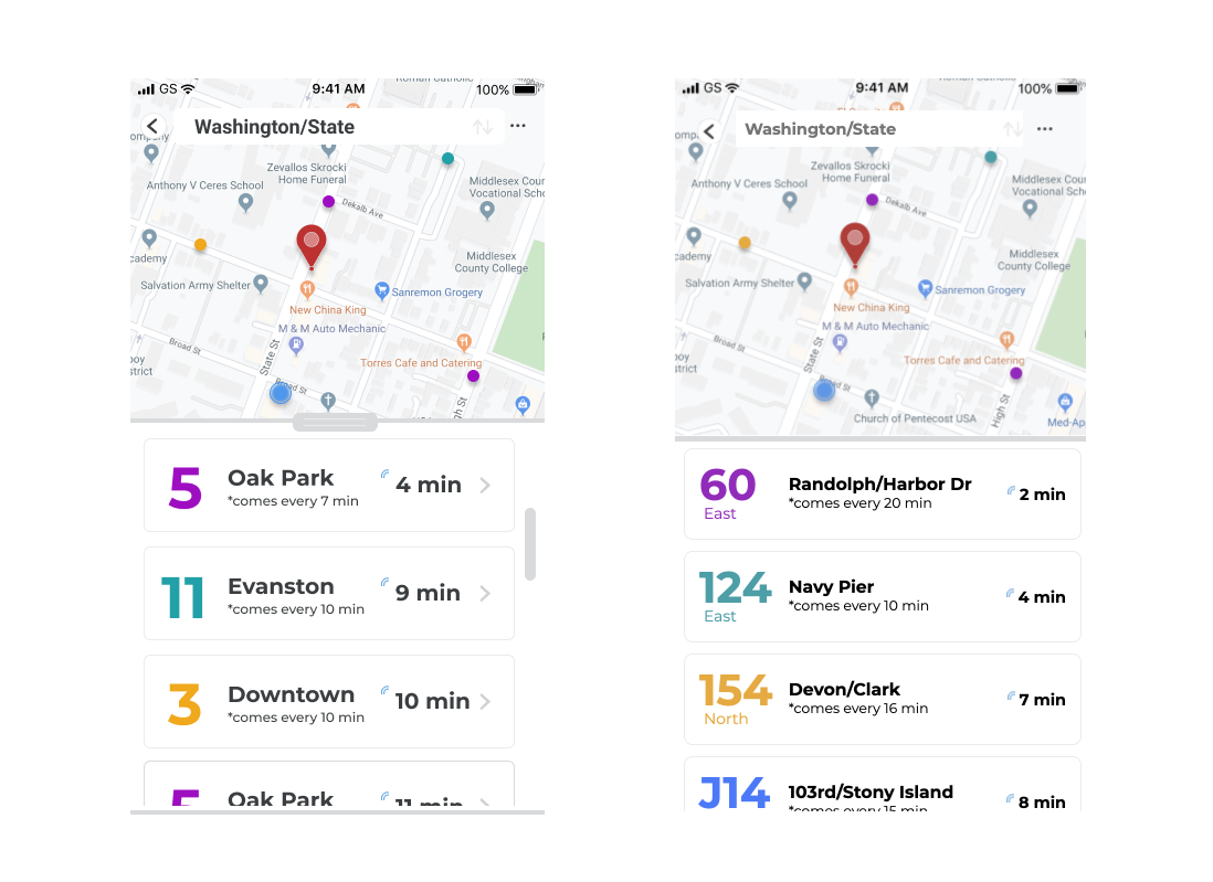
The city is experiencing bus congestion issues mainly with a stop at Washington and State. There are seven bus lines servicing the stop and users are growing increasingly frustrated with how difficult it is to know which bus is theirs and when it's coming.
How do you succinctly display
1) numerous buses,
2) going different directions,
3) with different arrival times?
To solve for this, I designed and coded a screen that gives an easy view of the available bus routes that clearly show which direction they're moving in while providing live approximate arrival times.
Through initial survey research, I discovered that most frustrations and desired features centered around the idea of wanting to know when a rider’s specific bus is expected to arrive in real-time. 50% of respondents indicated confusion over over when their bus would arrive and where their bus stop is as pain points in the bus riding experience. To address these, I wanted to include live expected bus arrival times, a clearcut indication of which stop you’re at, and a clearcut indication of where each bus is going.
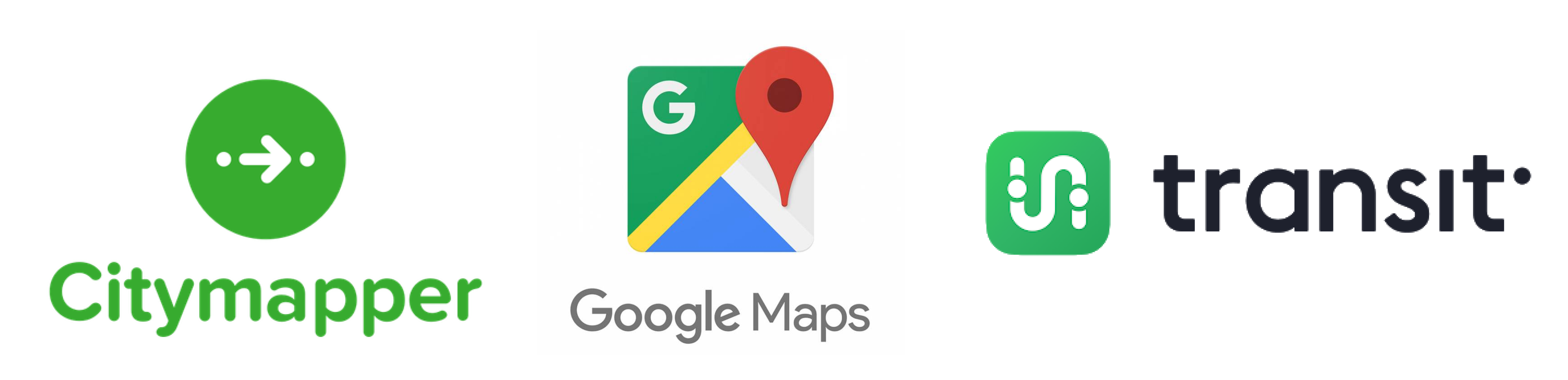
Each app I analyzed boiled down to the following:
1) City Mapper: “how do you want to get there?” with so much information on city-specific public transportation at your fingertips
2) Google Maps: “where do you want to go?” with its highly intuitive search function
3) Transit: “when will you get there?” with its on-the-go interface anticipating local transportation a user might want to take.
Taking that information and applying it to our specific problem in BusyBus, we have to consider that we’re working within a specified city on buses, looking at congested bus stops. While I would still want to adopt a usable search function, easy to access navigation routes, and location tracking; I would want to adapt it for this app and make sure the focus is on "which route should you take?"

Based on the client's concerns and user's frustrations, I pinpointed three high priority stories that need to be addressed in the design:
1) Ability to search for my destination
2) Access to directions or a map to get to the stop
3) Ability to see how long before the bus arrives
I translated my sketches and user stories into a paper prototype which I eventually used to inform a coded screen in HTML and CSS.
Using the paper prototype, I asked my participants to complete the following tasks to test the usability of my design to solve the problem:
1) Identify how long it would take for them to get to their bus stop
2) Identify how many minutes away their bus is from their bus stop
3) Identify the estimated arrival time to their destination
All participants were able to complete the tasks whether indirectly or directly. Two of the three participants directly navigated through the app as expected. One participant frequently returned to the home screen to complete each task. The search bar in the middle of the screen proved useful in guiding people to start their navigation search process.
Through testing, it was evident that most users appreciated the search bar being readily available on most screens, so I made sure to include the search bar at the top of the screen with the map behind it to give context to the user’s location and their search.
I also needed their destination, the buses servicing this station, and the live estimated bus arrival time to be highlighted and therefore chose larger and heavier fonts to bring attention to these pieces of information. Originally, I also had all of the buses shown on the map in the same color. However, after testing, a couple participants indicated wanting to know which bus was which, so I decided to make each different bus line a different color.
After sending in the initial mockup, the client decided they also wanted which direction each bus was going in, so I made adjustments to accommodate the extra information and made the design more in line with iOS standards.
Finally, I coded the design in HTML and CSS with a live text box for the search bar and scroll function.
On this project I learned how to prioritize user's needs and focus on a specific problem at hand. Focusing on the particular problem brought to me allowed me to focus my research, user story prioritization, and design. I learned to adjust my design when there are last minute requests yet not compromise usability. I familiarized with iOS design regulations and HTML/CSS as I stumbled and struggled to get the code to behave in the way I wanted.