Kermitt is a cloud storage solution for memes where users can easily save and send memes at their leisure.
Design Roles
UX Research
UX Design
Visual Design
Design Deliverables
User Survey
Competitive Analysis
User Personas
Wireframes
User Testing
High Fidelity Mockups
Preference Testing
Clickable Prototype
Tools & Software
Google Forms
Figma
Usability Hub
Principle
I was given an open-ended client pitch on cloud storage and gave it a direction, brand, and clickable prototype. This involved performing user and competitive research to find a niche in the space, defining a brand and voice for the product to follow, and creating and testing a final clickable prototype. The end result was a cloud storage solution for memes for users to quickly save and send content seamlessly.
The client presented an opportunity to build a cloud solution from the ground up. They had a laundry list of features for content and collaboration they wanted to include, but the product they had in mind was undefined and directionless.
To solve for this, I came up with a 3 part solution:
1) define a direction through various methodologies of user and competitive research
2) create a brand and style guide, and
3) produce a desktop and in-app clickable prototype in Figma.
Through preliminary survey research, I discovered that users are most interested in a cloud storage solution that seamlessly integrates with their existing devices and other apps/products and are easy to navigate. They highly value organization in these spaces and are interested in easily sharing their files with others as necessary. It must serve some purpose beyond being just “fun”.
Performing a competitive analysis of the cloud storage landscape brought attention to the flows that users are already familiar with (ie. onboarding with integrated solutions such as Facebook or Google) that I would consider adopting. It also illuminated the space for a meme storage app since each cloud storage solution has a niche purpose and use, it was evident that there wasn’t much competition surrounding saving quick cultural content.
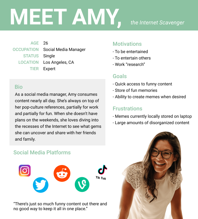
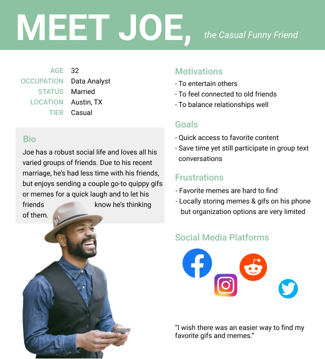
The survey indicated that the main audience interested in a meme storage app were millennials who were primarily concerned with organization and integration into existing lifestyle. Our personas reflected those who wanted to continue engaging with their friends and family through memes in a more convenient and organized manner.
.png)
Judging by the user’s personal priorities when it comes to cloud storage solutions as well as necessary features for the product to work, I decided the following features would be of primary importance: accessing the user’s account, storing and deleting memes, and the ability to integrate with existing devices and accounts to save and send content.
I sketched out basic user flows that would inform my MVP which I fleshed out and finalized on Whimsical into user flow diagrams to reference throughout my design and prototype development.
I translated my sketches and user flows into wireframes within Figma which I eventually used to create a wireframe clickable prototype. I performed a test with the wireframe clickable prototype on three users and found that while it was altogether decently usable, it could use some changes.
While all users were able to complete tasks with little to no prompting, some did have questions along the way, which illuminated expectations and desired views. Some notable user feedback included the following: It should have a back button for on-boarding, the “Add content to folder” screen is not very intuitive, include confirmation of folder creations - either ending creation process in the folder or show that the folder’s been created, and include confirmation of deletion and clarify from where it’s deleting.

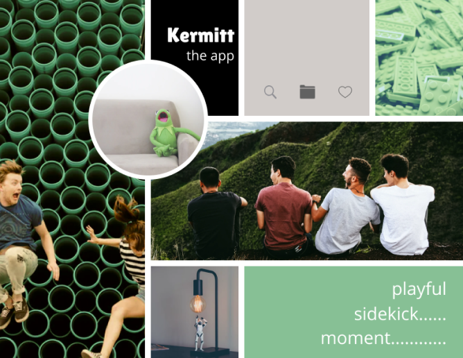
When brainstorming what Kermitt’s brand should look like and entail, I thought back to the main purpose I wanted this app to fulfill. This was a cloud storage app for memes. Practical, yet playful. This is the branding summary I came up with that would inform the rest of my design:
Introducing Kermitt - the meme storage app. Named after one of the most famed memes of our time, it’s the sidekick you never knew you needed. There to assist you in achieving all your meme dreams; it’s there to enable you to grasp that fleeting moment and send the perfect meme at just the right time.
It’s a bit playful as it enjoys a sense of humor yet understated and clean looking as it efficiently organizes the user’s content. It exists to enable those brief, lighthearted moments, hoping to multiply them.
Yet this isn’t about Kermitt. It’s not even about humor at large. It’s about the here and now, where we are in this specific cultural moment. And it’s about the meme. And most importantly, it’s about allowing you to share in that with whomever you want.
I created a moodboard to reflect the brand I was hoping to convey.
Through many iterations and variations, I created a logo, defined typefaces and a color palette, and compiled it all into style guide.
See Style Guide
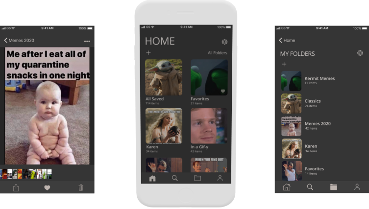
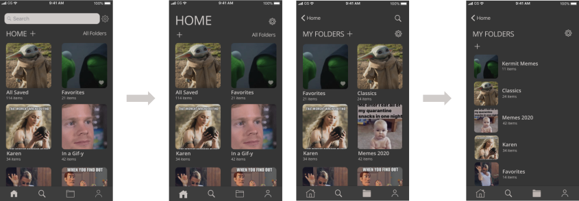
Based on the wireframe testing feedback, I created mockups of all the screens in adherance with the style guide.
I also tested a few different views for three screens (onboarding, desktop homepage, and folder icon) to see which users preferred. After analyzing those results and determining which screen was most popular and why, I made adjustments to my screens accordingly.
After creating my high fidelity mockups, I pieced it all together to create a high fidelity clickable prototype, complete with transitions and an opening animation.
I tested this clickable prototype on three users and analyzed the results. I discovered that the home screen could communicate what the app does better, the home and folders views were too similar, and users were still confused where a meme was being deleted from and needed a clearer confirmation.
Based on the feedback from the usability tests, I made changes to the prototype to address usability concerns and minimize confusion when completing actions. As a final touch, I used Principle to design a splash screen animation. See the final product below.
View Mobile PrototypeView Desktop PrototypeOn this project I learned that differentiating screens in obvious ways, communicating effectively , and consistency are key. Making each screen distinct from the next makes it easy for the user to navigate through since they will more instinctively understand what they are looking at. Communicating actions and their consequences (ie. deleting a meme) is key in helping the user with their decision making as they navigate through the app. Keeping all of these distinct screens consistent among various integrations also helps the user navigate from platform to platform so they know what to expect as they click through familiar buttons.