Slant news is a platform that encourages understanding a variety of perspectives and provides summaries on top stories of the day based on top news sites across the political spectrum.
Design Roles
UX Research
UX Design
Visual Design
Design Deliverables
User Survey
Competitive Analysis
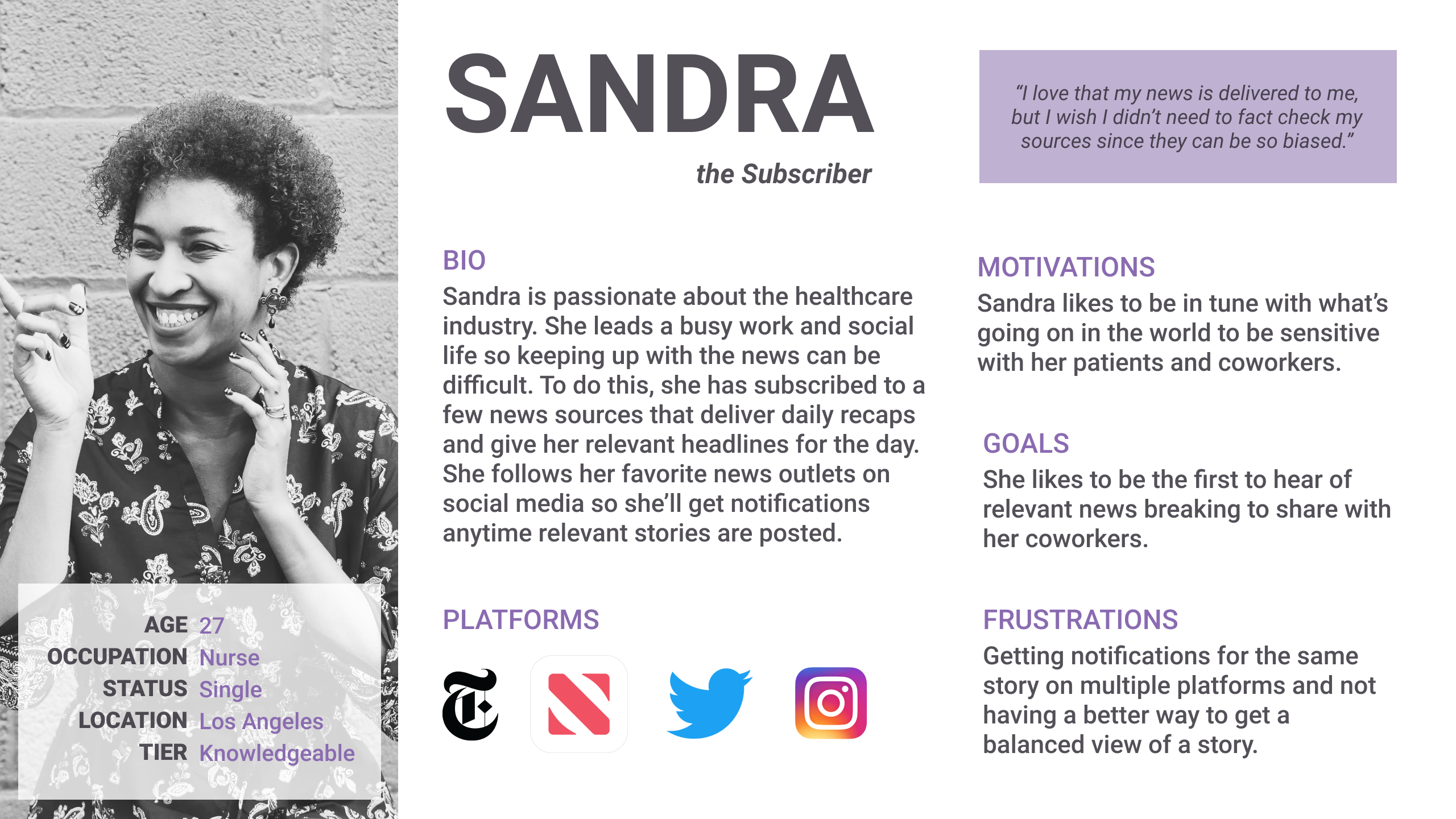
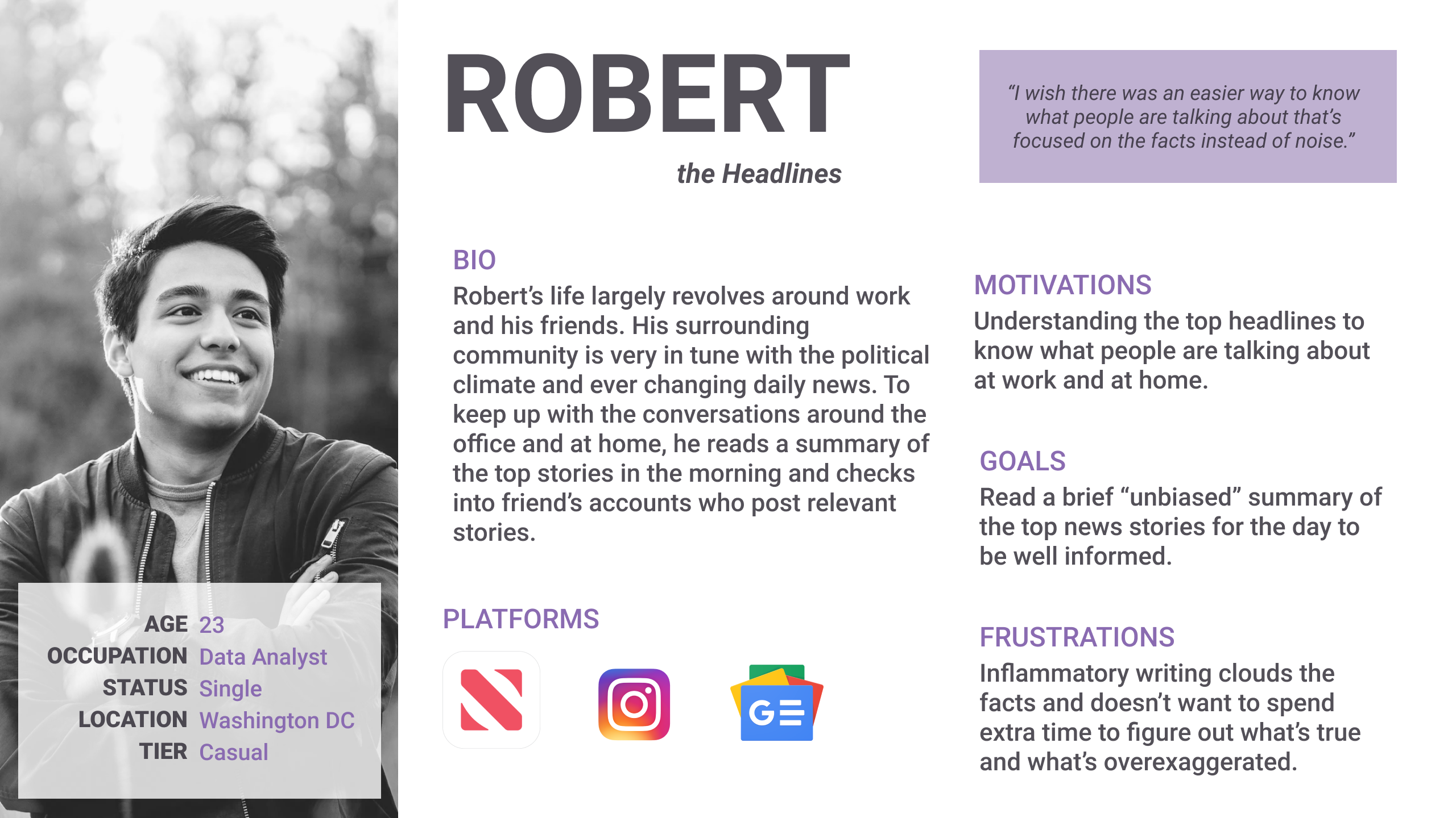
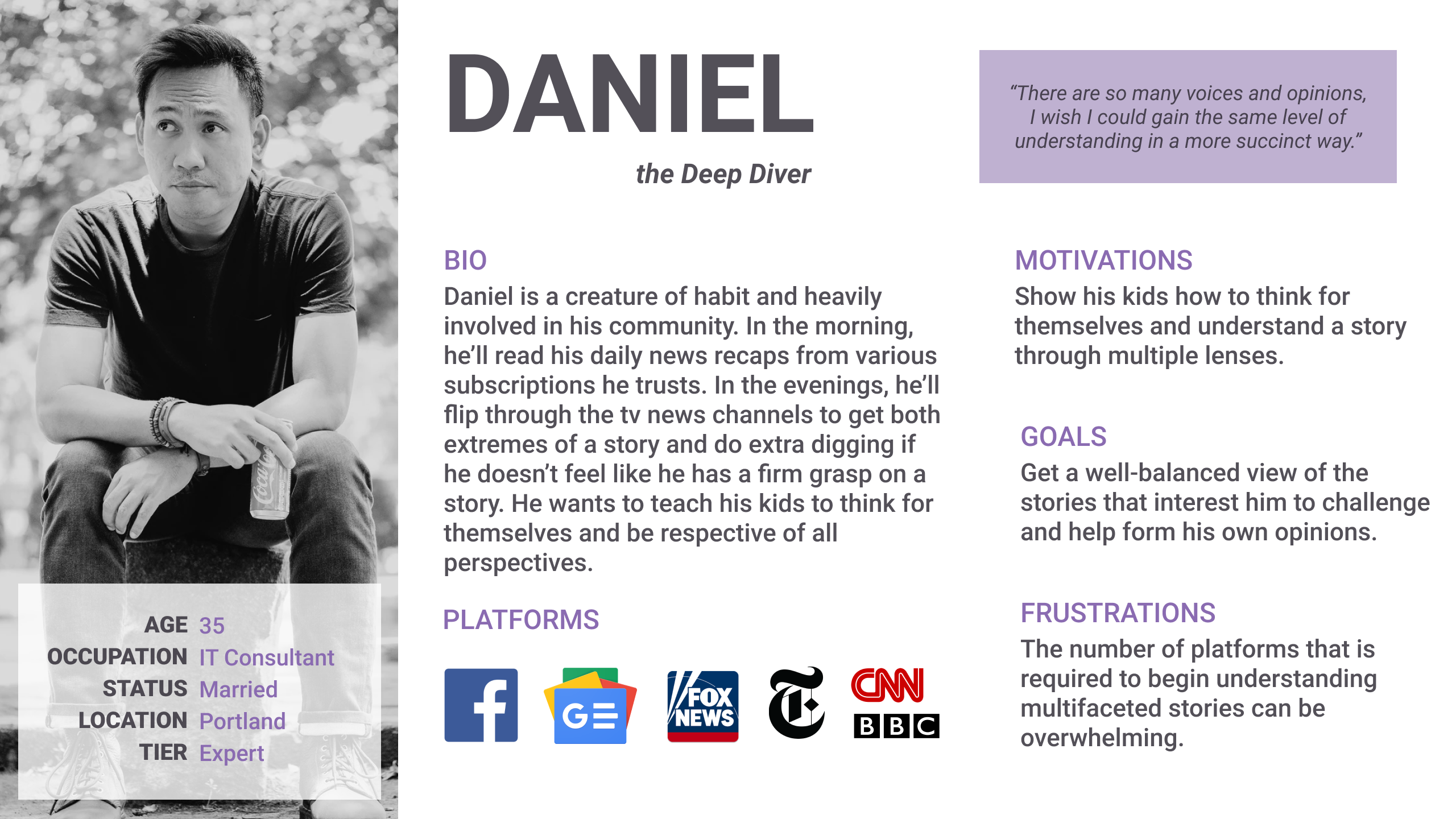
User Personas
Wireframes
User Testing
High Fidelity Mockups
Clickable Prototype
Tools & Software
Google Forms
Figma
I was given free reign to design an app and website from conception to prototype. This involved research and discovery, organizing and prioritizing information and tasks, defining a brand and voice, and consistent design and usability across the mobile and web experience. Once those steps were complete, I conducted a usability test and updated my prototype accordingly, leaving me with a polished final prototype.
With the internet and social media tracking our interests, habits, beliefs, and then subsequently giving us content and narratives in line with those behaviors, we often find ourselves in a feedback loop of our own opinions. It becomes easy to have a one-sided understanding of a situation and makes discourse with opposing ideas more difficult. Many news sources out there already have a slight or strong bias and many news aggregation platforms automatically curate content to suit the user’s bias.
In an effort to diversify these voices in our lives, I wanted to create a news app that would help users break out of their echo chambers and tap into a variety of narratives.

After conducting a survey with 57 responses, I discovered that a majority of the survey participants primarily get their news from online, social media, or inapp. They mostly value trustworthiness in their news and being able to know what is going on in the world in a quick and convenient manner. There is strong interest in having less biased and more well-rounded perspectives in their news as long as it’s from a trustworthy source and likely not at the expense at convenience, cost, or timeliness.
I looked at Apple News, Google News, and Ground News when surveying the news aggregation landscape. These are formidable news aggregation outlets that are convenient for the user to access and they aim to give the user the top headlines, customizable to the user with opportunity for more in-depth reading should the user desire it. Ground news is the only one to attempt to reveal a bias as it shows a quick view of which way an article leans, red or blue. However, their app mostly features free, unrecognizable sources which hurts their credibility, and the amount of information displayed can come across as overwhelming. Apple and Google News are better, but the content is tailored to you and doesn’t often offer new voices. These also primarily provide an aggregation of available articles out there, putting the responsibility on the user to seek out multiple news stories for a well-rounded perspective on current news.
I conducted three interviews to dig deeper into user’s current news habits and platform preferences. Based on the interviews conducted, it seems people who are interested in this idea generally have a quick relationship with the news. They want to know what’s going on and be informed, yet most people will not go out of their way to get the news unless they hear about something they may not know about yet. Most people think it would be nice to have a more balanced view of a story yet will not go significantly out of their way to get it. Currently, people read a couple different sources with known biases to get a fuller perspective yet desire there to be less inflammatory language. Convenience, headlines, and balanced perspectives seem to be the consensus for a potential user.
Based on the survey and interview results, I discovered that our users like to be well-informed yet do not always have the time to read the breadth of information already available. They enjoy having notifications as it allows them to stay on top of the news and allows news they’re interested in to come to them instead of having to seek it out all the time. This also allows them to knowledge share in real-time and participate in the world around them. Our users are frustrated with the inflammatory language media often uses and feels the need to dig deeper into multiple sources just to get a balanced understanding of what’s going on.
.png)
Because this is a news app, the app/site is primarily concerned with presenting information to the user in a digestible manner. As such, many of the actions are more based on giving the user autonomy over how they want to consume this content (ie. navigating to content, creating an account, saving/following stories, updating notification settings) as these were the most frequently mentioned features people would want in a news app judging by the survey and interview results. A low/medium level priority would be allowing for further customization so the user could read more tailored content to them.
The user flows I have chosen correlate to the features most frequently brought up in the survey results and interviews. Interviews indicated that people want a brief easy summary to read through to be updated on the top stories of the day in a way that’s not inflammatory. Beyond that, notifications for certain topics or having the news delivered to the user was deemed desirable as well as having the option to dig further into a story if the topic interested them.
Survey results indicated that some news outlets were overwhelming in how much information was being displayed so I wanted to make sure my layout would be easy to scroll through and allow for deeper diving if desired. Interviews also made it evident that people wanted their news delivered to them, digestible in a non-inflammatory way, and allow for multiple perspectives without having to sort through too many articles.
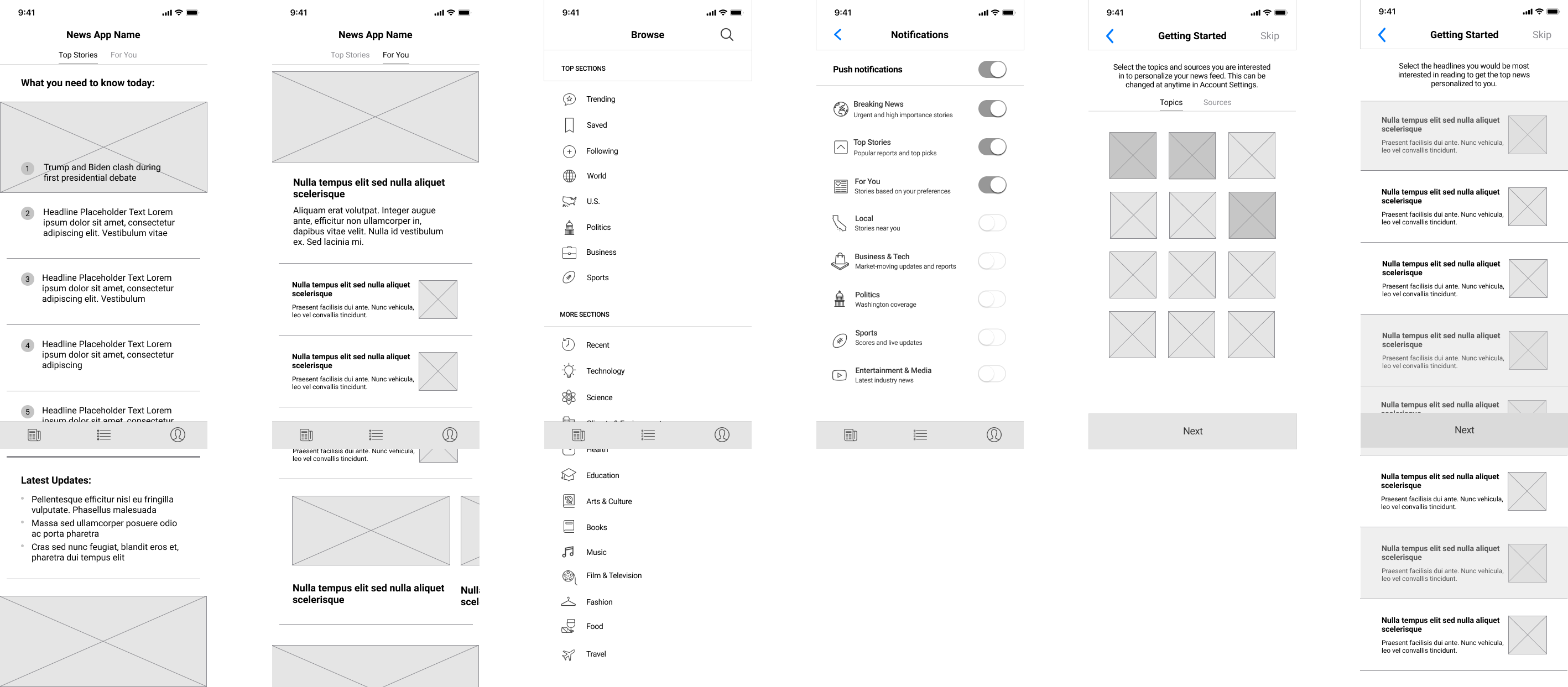
As part of my informal testing, I showed a few different layouts to potential users. A majority liked the wireframe version with the tabs at the top (as opposed to “headlines” and “for you” being on separate navigational bar tabs. For the web version, one person was concerned with how much space the summaries would take up on the page and neither liked the idea of having a carousel design for the summaries.
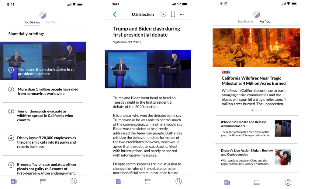
This led me to a more classic news design with one main highlighted story and the four subsequent summaries to its right, numbered to mirror the app design.
After many sketch iterations, I translated these sketches into wireframes to block off the content. I pulled a lot of inspiration from the New York Times app, but looked at a total of 14 news apps to determine what I thought would work best for my app. The goal of my app is to provide an overview of the news for the day in a non-inflammatory way, make diving deeper into stories easy but optional, and accessing differing perspectives more available.
I named the app/website Slant - a play on the idea that we all come with our own inherent biases and slanted perspectives, but this app helps us see our perspectives and introduce us to new ones. The logo depicts this idea as well showing two halves of a circle, color-blocked and at an angle. This visually depicts this idea of slanted perspectives, yet together, creates a literally, well-rounded circle.
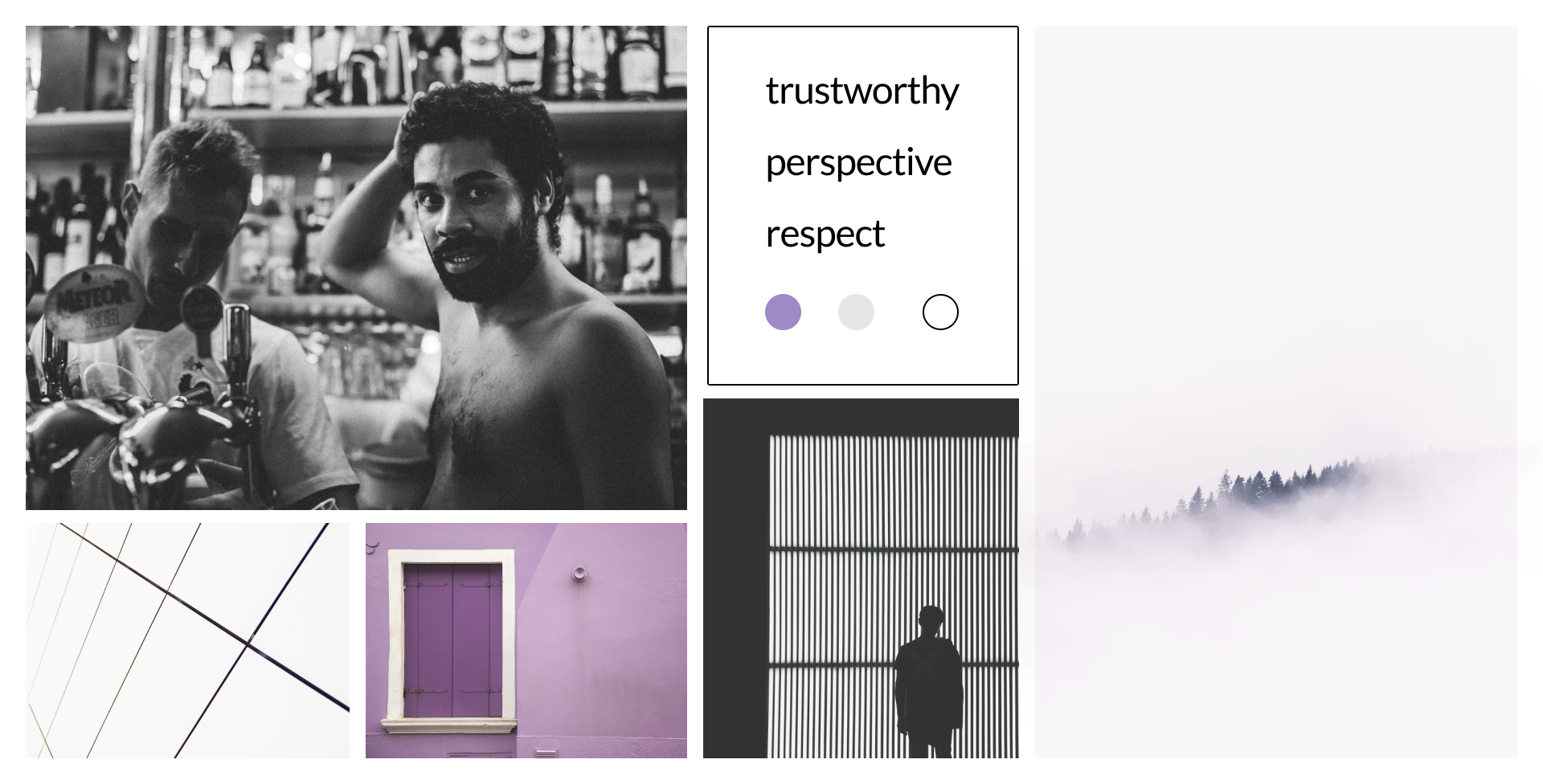
I created a moodboard to reflect the brand I was hoping to convey featuring sleek lines and purple splashes of color.
Through many iterations and variations, I created a logo, defined typefaces and a color palette, and compiled it all into style guide. I decided to go with a muted purple as my main splash of color - conveniently a mix of blue and red which helps with the idea that this app aims to provide perspective and well-rounded opinions. The layouts and corners are cleancut and only slightly rounded to give a sense of clarity and professionalism. I played around with a few font combinations, but decided that only one typeface was necessarily as it provided a more cohesive final look.
See Style Guide
I filled in my wireframes with photos and content based on the content strategy I compiled earlier in the project. I used various layouts to present the news stories in the Top Stories and For You tab including horizontal scrolling. To allow users to dig deeper into a story, I provided a list of sources that fed into the overall summary as well as more reading at the bottom of the page for Further Reading & Further Perspectives.
I also included an onboarding process to get insight into what content the user would be interested in. This would provide the basis for what sources they may already trust and read and what new perspectives they could be exposed to. I added in the color and typefaces into the design as delineated in the branding.
After creating my high fidelity mockups, I pieced it all together to create a high fidelity clickable prototype, complete with transitions and enough content to scroll and click on a couple articles.
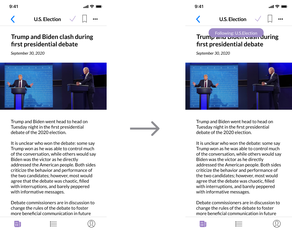
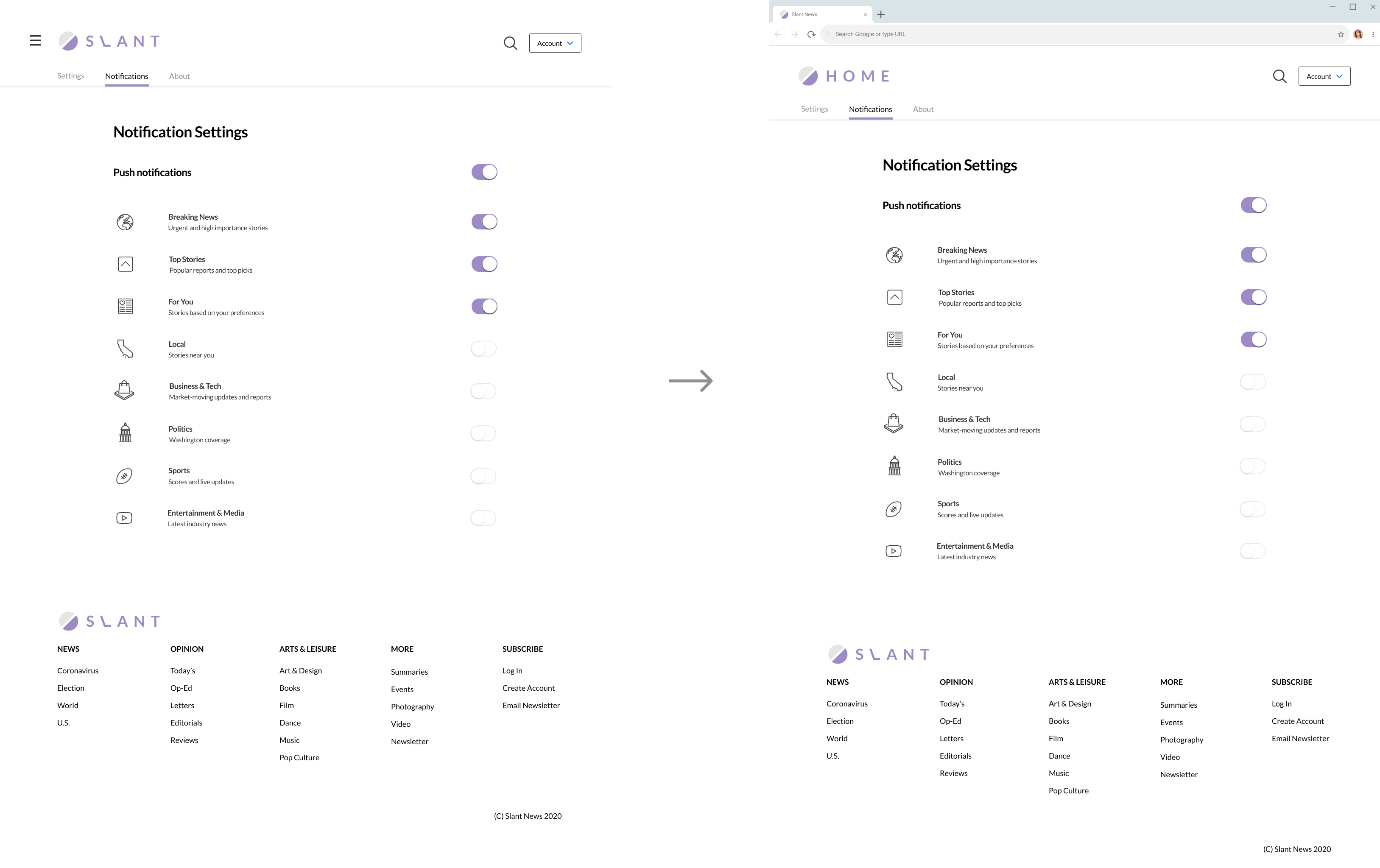
After prototyping the mockups, I tested it on 3 different users. Users were quickly able to decipher that this is a news site, one user was able to describe to perfection the purpose of the site in being a news platform that encourages multiple perspectives on a story. Users were largely able to complete all scenarios presented to them. The only notable points of confusion came from the Follow button represented by a plus symbol in the app version, and the ability to navigate home from the notifications page on the web version.
Based on this feedback, I made a few changes. I added a confirmation notification when the plus symbol is clicked so the user understands the use of the button. I also changed the header of the notification page to minimize confusion on how to navigate back to the main pages. I achieved this by removing the “Sections” navigation panel and changed the logo to indicate “Home”. I also changed the wording on the summaries portion of the layout to read “Slant daily briefing.” It seemed that users were unaware of the difference between an article and a Slant summary and weren’t entirely sure what the numbered stories indicated beyond being important news stories for the day. I added this text to the web version as well to clarify the purpose of the numbered headlines.
On this project I learned that research and comparing competitive platforms helps in leaps and bounds to create a fairly successful starter prototype. I also learned that in any action a user takes, feedback is extremely important. While widely understood symbols like the bookmark do not usually need to be explained, other more ambiguous symbols like the plus symbol could have multiple uses, so making it clear to the user what they’re doing can help immensely. Other widely known symbols such as the 3 line sandwich navigation is so commonly used for a specific purpose that it can be confusing when it is not meant to be the primary form of navigation on all pages.