
Zozu Shop is an e-commerce site for non-profit organization Zozu Project where donors can easily purchase items that support the organization online.
Design Roles
UX Research
UX Design
Visual Design
Design Deliverables
Competitive Analysis
User Personas
Wireframes
High Fidelity Mockups
User Testing
Clickable Prototype
Tools & Software
Figma
Zozu Project is a non-profit organization that sells handmade jewelry and other products as part of their fundraising. I approached them with the idea of creating an e-commerce platform for these products they typically sell at in-person events as an additional avenue for users to connect and support the organization.
This organization has not had an e-commerce presence for those who have wanted to support the organization from afar. The client's primary concern was making the administrative side extremely easy to use since the person managing the site would likely be a volunteer. Another concern was the one-of-a-kind nature of their product and wanting to communicate with their user through the site should the visitor have any questions.
To solve for this, I came up with a 3 part solution:
1) design a customer facing e-commerce site,
2) make it easy for the visitor to contact the organization, and
3) design a simple administrator site with an easy learning curve to manage the site.
I performed a competitive analysis of the e-commerce landscape from an administrator and customer perspective. This gave me ideas of what users and potential volunteers managing the site might be familiar with. This also brought varying methods of informational architecture to light depending on the product offerings available on the site.
The organization sent me a list of all the products they offer. At first glance, the majority of the product seemed centered around jewelry with a handful of other products of great diversity. Though I had an idea of how to organize it, I wanted to verify my thinking. I performed a card-sort study on three participants and found that jewelry and homeware with subcategories underneath were primarily how people naturally organized this information in their minds. One user started organizing this way, but switched gears and sorted the products by a type of event he would throw. While not used in the shown prototype, this organizational thinking could be helpful for future homepage marketing or subcategories.
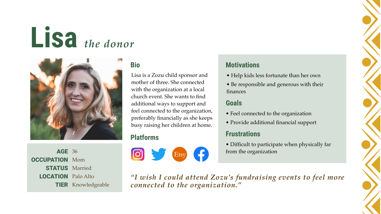
Judging by the information the client provided, the main audience for the customer facing site would be donors who want to support the organization outside of the in-person events. The administrator facing site would likely be a volunteer for the organization and would require an easy onboarding experience. These personas reflected those who would be involved in the organization in these ways.
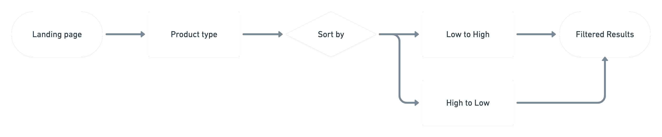
After coming up with a plethora of potential user stories for both the admin and customer facing sites, I met with the client to finalize what user stories would be included in the final prototype. In addition to the basic functions of an e-commerce site, we included the ability for the user to message the organization from the site and filter product results based on color and product type. In the admin site, we decided to include product tagging to easily differentiate batches of product as well as an easy way to track order fulfillment.
I fleshed out and finalized user flow diagrams for these user stories on Whimsical to reference throughout my design and prototype development.
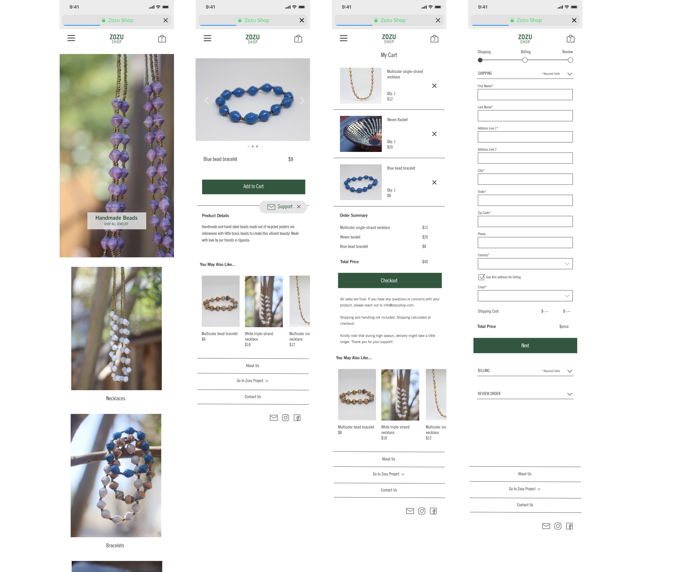
I translated my sketches and user flows into wireframes within Figma for both the customer and administrator facing sites.
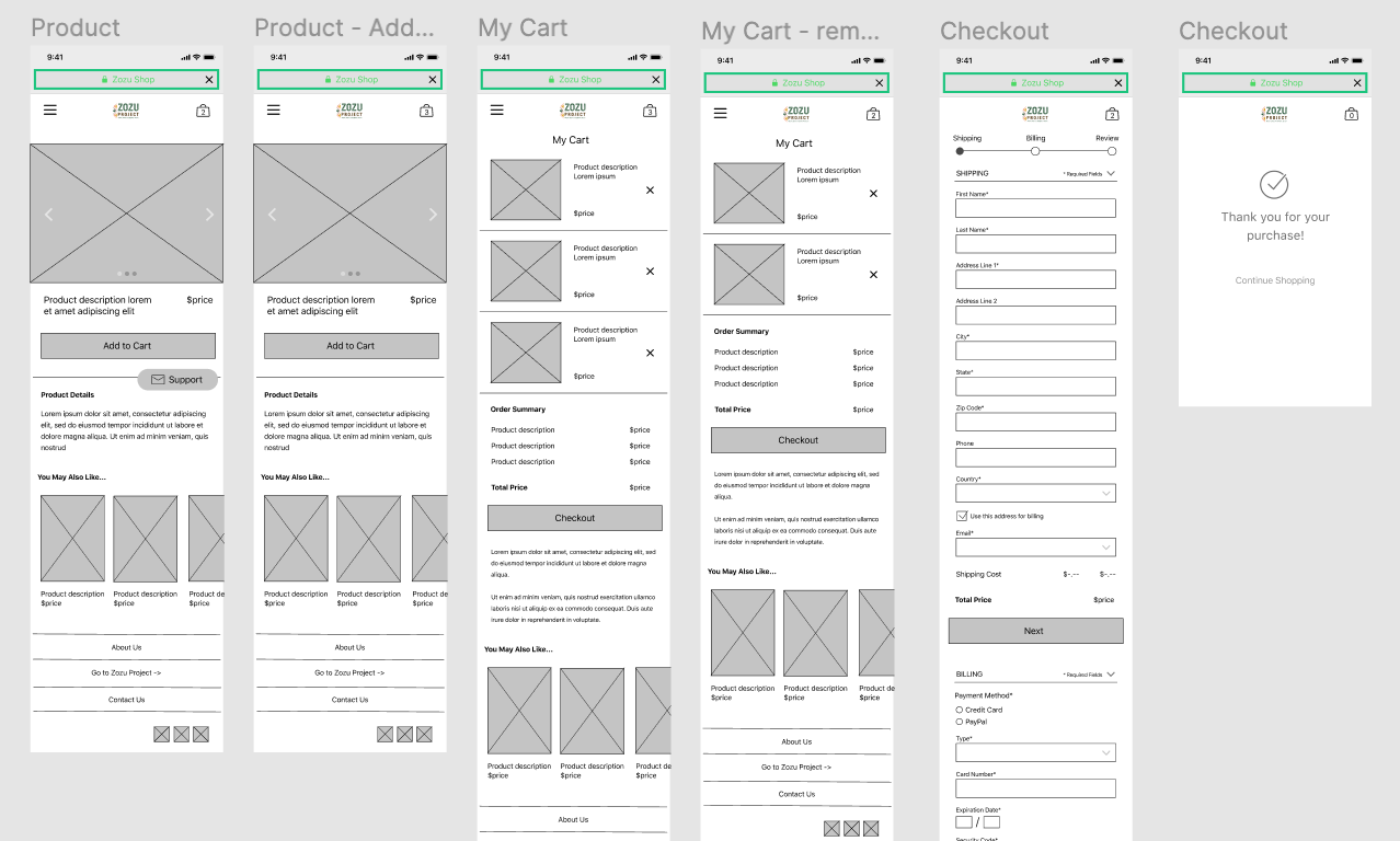
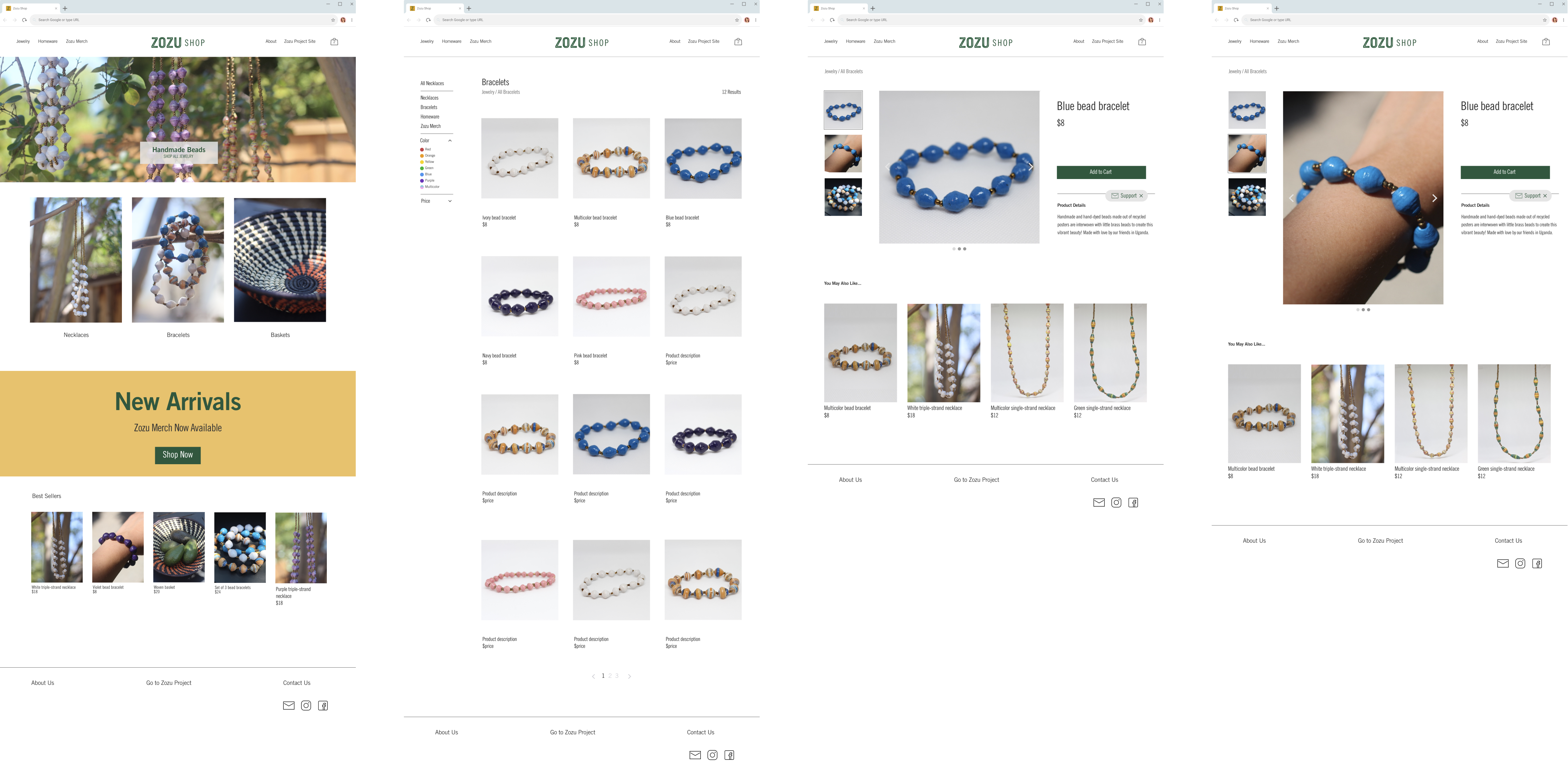
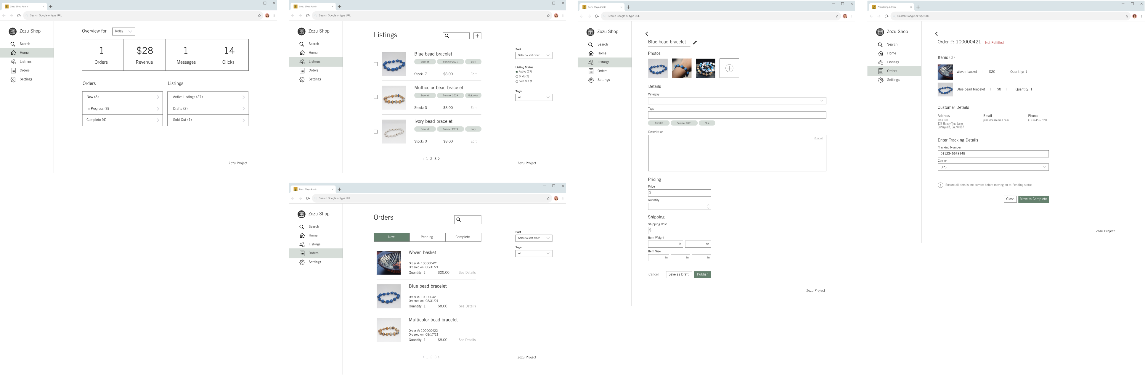
I filled in the wireframes with photos I took of the product and content based on their product offerings. I added in theme colors and fonts based off of the original theme from their organization landing page. I completed mockups of the customer and administrator facing sites for desktop and mobile with all agreed upon user stories built out.
With the mockups built out, I connected the screens to create a high-fidelity clickable prototype for user testing.
After prototyping the mockups, I tested each version of the sites on 3 users. Users were able to quickly determine the purpose of each site, one being an e-commerce site for jewelry and the other being the administrator site behind the scenes.
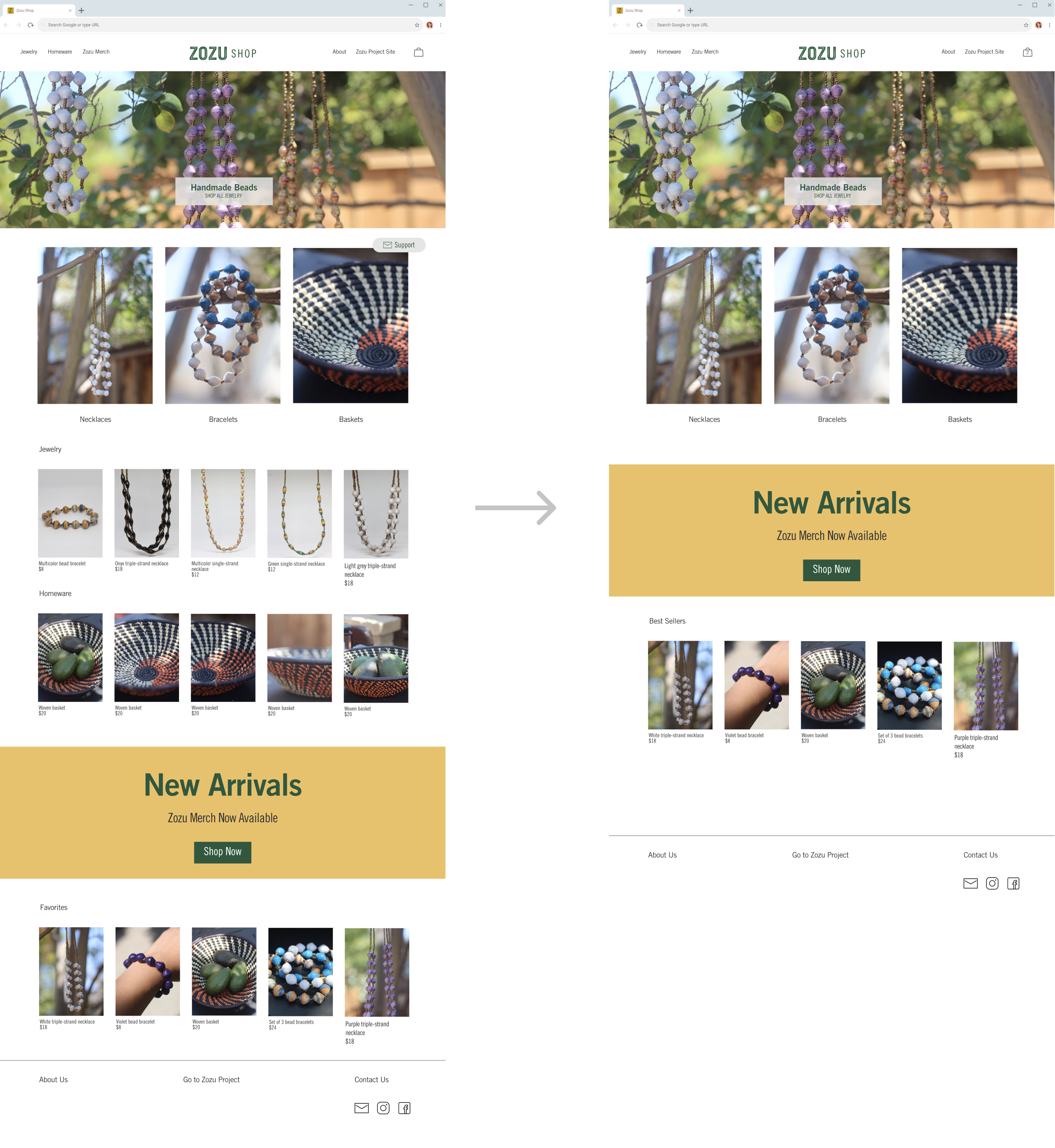
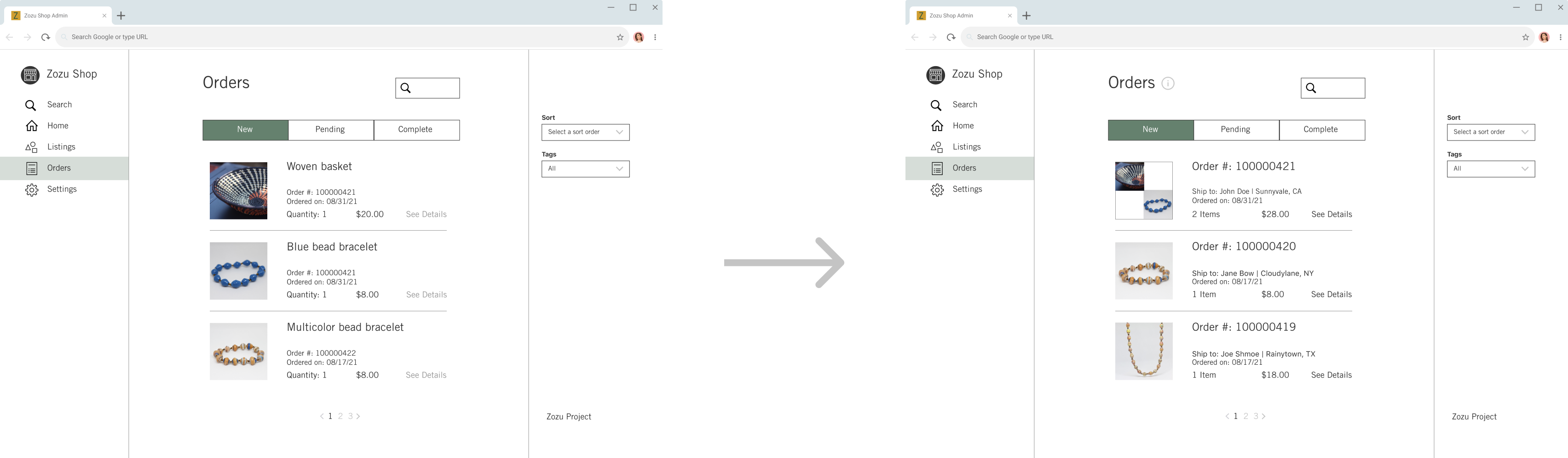
After analyzing the results from the study, I discovered a few key points of improvement. For the customer facing site, I discovered that the homepage could be simplified as some people thought the category breakouts were either confusing or repetitive. I also learned that the checkout process could be clearer with each step collapsed until the “Next” button is clicked. There was also a suggestion to make the support button collapsible to avoid covering the screen and to make the product results automatically update after selecting a filter. For the administrator site, I discovered that the light grey text looks like an unavailable feature, deleting a listing requires too many steps, and order listings should be organized by the order # instead of the product.
Based on this feedback, I made several changes. For the customer facing site, I simplified the homepage and just included the main categories and changed Favorites to Best Sellers to clarify terminology. I updated the checkout process and collapsed each step until the user clicks on the Next button. I made the Support button close-able, but the user can still contact the organization on every page. For the administrator facing site, I changed the listings to make the Edit button the same color as the rest of the text and added a Delete button from within the listing. I also updated the orders page and made the Order # the primary organizational header with the products listed in the details.
On this project I had the following takeaways:
1) How to manage a client relationship. Keeping client goals and concerns front of mind is of primary importance in order to directly address the problem areas they've identified.
2) Things can change. Part way through the project, I was informed that the organization was adding different merchandise they wanted available on the site. To accommodate the update, I adjusted my design to include the additional product offerings.
2) Following pre-established patterns in familiar sites is helpful. A majority of the user flows ran smoothly -likely due to its familiar nature to existing e-commerce sites.
3) UX writing is extremely important and every bit of language is communicating something. As such, the text and intent behind the words must be clear.